Showing posts with label Inspiration. Show all posts

Sunday, October 17, 2010

Inspiration: Blinded By Sight

Rarely do I write a personal blog, but this has really been on my mind this past week and I thought I'd share my recent inspiration. Let me give you some backstory (the first half of this blog)...

I was drawn to working* with children because of their simplicity. There is an innocent bluntness about them that LACKS a filter--which keeps me on my toes.

One child inparticular has fascinated and inspired me so much so that I’m going to blog about it. Let me introduce Jacob** , an adorable 8 year old who loves reading, jumping on the trampoline and can tell you anything about baseball because it is his favorite sport. You can find him skipping down the hallway or chatting with his friends. He is very inquisitive, asking about anything and everything. What makes Jacob so different is that he is BLIND.

I promise if you weren’t looking closely, he blends right in with his classmates. The only difference is that he reads Braille instead of regular books. Jacob doesn’t walk around the school with a walking stick—he actually knows the campus so well that he literally tries to jog to class sometimes—just like any other child. He is spunky and doesn’t see his blindness as a weakness, but as something that makes him unique.

I saw this when I witnessed Jacob meeting a new friend the other day. “Hey...can you see anything?” a curious little boy asked, as he ran up and waved two hands frantically in front of Jacobs face.
“Well…” (looking in the direction of the little boy) “I can see some color, but other than that—nope! I can’t!”
“Cool!”
“What’s your name? Would you like to play Bop It with me?” Jacob responded.
“Okay!” and the boys proceeded to play a game of Bop-It. The little boy didn't see Jacob's blindness as an issue because Jacob didn't make it one. See? Simple.

Working with Jacob has really challenged my thinking—I saw it as an obstacle to work around and he is so at ease that he sees it as something special. I couldn’t resist asking him about his story when we first met. He wasted no time asking me about mine! He told me how it was hard when he was a baby, but now he knows every familiar environment almost by heart—and almost everyone’s voice in the entire school! Of course I had to test him one day and when I called to him, he shot back "oh hey Mrs. Rose!"

SN: He showed me how he reads Braille and even read the Braille under the “storage” sign by my room (and promptly told me that “somebody made a mistake—this says 'Korage!'”). How funny! But I digress...

It’s so amazing to me how in tune with his other senses he is—instead of depending on vision to guide him—he uses his heightend sense of sound, smell and touch.

Working with Jacob has reminded me of two experiences that I have had. 1. Watching that Val Kilmer movie At First Sight where (**spoiler alert) Val Kilmer’s character has an operation (because his girlfriend urges him to) to restore his sight after a lifetime of being blind—and once he is able to see, he is lost, because he only knew what things looked like by touch. Therefore he would see an apple and have no idea what it was until he picked it up and felt it. Didn't think of that, did you? He went on to hate being able to see and started blindfolding himself so that he wouldn’t feel so lost in this world. His girlfriends plan backfired on her and in fact she was the one who wasn't able to see that as a possible outcome.

How crazy is it that we assume a blind person would be lost in our world when in fact sight is sometimes what screws us up! It is sight that causes us to be judgmental and superficial. And sight that causes so many prejudices and at times segregates this broken world. Yeah--marinate on that for a minute. Sight is a strong source of sensory information--so much so that many times it overrides our other senses—(hence optical illusions).

The second thing I thought of was a beautiful experience I had with my sister-in-law last summer in Atlanta called “Dialogue In The Dark”***. This is an exhibit that was a little over an hour and was in TOTAL darkness. That’s right—they take away your vision so that you can truly experience how a blind person feels in our world. How amazing and profound it was to have to rely only on my sense of touch, smell and sound!

Prior to entering, you are equipped with a walking stick and later hear that you will be following a guide (who is blind) and then you are guided through a variety of environments that you may encounter on a typical day. At first I was terrified of the darkness, and felt lost and alone in the pitch black of our first location--but quickly located the voice of my sister-in-law and my heart stopped pounding as we grabbed each others hands tightly the rest of the tour.


They don’t give you any hints as to where you are—you have to use your other senses to figure it out. You even have to recognize and follow your guide’s voice in a crowd of people to know when to walk and where to walk to. By the end of the tour I knew by the clearing of his voice which guide was mine and in which direction I needed to walk to stand by him.

The one thing that you don’t realize until the very end of the tour, is that you only know the voice (and approximate height) of your guide. So when you exit into the light and you can see again, you find yourself in a large crowd--but you have no idea who your guide is until he speaks! I had this image in my head of this 65 year old, gray haired, paper thin skinned chocolate man based on his voice alone—and in fact he looked like a 38ish year old, fare toned Bernie Mac! How funny that a voice alone created an image in my head based on my previous life experiences and visual influences. What If I had never seen before like Jacob? I wonder how I would imagine then?

The highlight of the tour was the very end, where we got to ask our guide whatever we wanted. People asked him about his life, how he came to be blind, and even how it has affected him. It was refreshing that he had such a positive outlook on his life—and even though he lost his vision as an adult (from getting accidentally shot with a stray bullet by being in the wrong place at the wrong time) he took it as a blessing, and talked about how he wouldn’t have met all of the wonderful people that he has if it wasn’t for his accident.

I feel honored to have met 2 people in a similar situation BOTH with such a positive outlook on life, considering how much others would see it solely as an obstacle.

This has inspired me to appreciate what I have and to know how truly amazing it is to be able to see the vibrant colors, landscapes, beautiful faces, and scenery in the world around me. It has also opened my eyes to see that sometimes you don't have to have vision to appreciate other beautiful things in this world...personality, laughter, the sounds of nature and my personal favorite--hugs.

Maybe this has tickled your brain enough to sink in. My hope is that it will influence your way of thinking and allow you to appreciate the little things that you have been blessed with that make YOU unique. Appreciate yourself today. Flaws and all...


Have a great Monday!

Love,

Rose
P.S. I also encourage you to try the Dialogue In The Dark tour if you are in the Atlanta area--it would be a great family outting, girlfriend get together, or second+ date! Definately makes for great conversation!

*Professionally, I am a certified/licensed pediatric occupational therapist—and I’m a badass!

**names have been changed to protect the innocent

***Dialogue in the Dark has been presented in over 30 countries and more than 160 sites in over 110 cities throughout Europe, Asia, the Middle East and America since it’s opening in 1988. So far, over 6 Million visitors have experienced Dialogue in the Dark worldwide, and over 6,000 blind candidates have found employment through Dialogue in the Dark. In the USA, there is an exhibit in Atlanta, Georgia.

Wednesday, October 13, 2010

Home Décor: My Living Room's Face Lift


I haven’t really done a blog on home décor yet and yet it is one of my favorite things to do! Decorating a new home or re-doing a familiar space is therapeutic and it really allows me to unleash my creativity. I have been told that I am “craftsy” before—but I don’t take that to mean scrapbooks and paper dolls—more like I can make something amazing out of anything—no matter how bad.

How would I describe my home décor style? I’d say modern with a nod to tradition, sleek and simple (no surprise, huh). I love old hardwood floors, color blocking, abstract paintings, lots of family photos and I always opt for the darkest espresso shades of wood. But I also like for things to feel like home—just imperfect enough and comfortable enough to not feel like a model home...

There are two things that I dislike when it comes to decorating—1. When things are so perfect that it doesn’t feel lived in (and therefore you aren’t comfortable out of fear that you may knock something out of place!), and 2. When it is obvious someone hasn’t redecorated since your visit 15 years ago (grandmas are excused because it’s actually quite nostalgic to visit and feel like you were warped back to your childhood—baby blue paisley couches and all!)

Anyway, one of the projects that I had the pleasure of working on this past year was my home in Connecticut. We moved into this quaint colonial style house in New England, and my assignment was to redecorate the living room and the study— two small rooms on the main floor with the original hardwood floors still intact (yes!).

The previous family had painted the top half of the walls a stale and dusty periwinkle blue and the bottom half a sparkly (yes, sparkly) cobalt-ish blue. The kitchen was—and still is--canary yellow. Yeah. I have NO idea!

My first thought was PAINT IT—I could try to make the blues purposeful but it would have been too much of a stretch (and to be blunt the colors weren’t doing anything for me). I tend to gravitate towards warm colors for the parts of the house I will spend most of my time in, again, to make it feel like home.

My second thought was where do I draw some inspiration? Sometimes inspiration can be a color, a fabric, a painting or picture, an area rug—or even a comfy old couch that molds to your body. I’m a sucker for those oversized couches—the kind that you blink and then wake up an hour later having slept through your entire show!

Well, for this project I was inspired by this beautiful burnt brick reddish color. Now before I delve into painting—I plan out my space and consider all of the possible components:

1. What are the dimensions of the room and how can I maximize this space?

2. What colors will look good together and what type of accents do I want in order to
create a space that feels like me (i.e. plants vs. vases, photos vs. art, vintage wall hangings vs. 3 dimensional art etc.)

3. Does my color scheme allow for flexibility and easy updating—i.e. Will it be easy to change it up season to season or year to year with new throw pillows, accents or a different area rug?

Once you can answer these questions (and everyone is different), you can begin your project.

No matter how small your budget, you can always give your home a face lift--sometimes it is as simple as de-cluttering.

To help nudge you in the right direction, here are some quick and easy updates/ideas that I have used in the past (and for this project):

1. Framing fabric with abstract prints—I actually got this idea from strolling through one of my favorite stores—Crate & Barrel. I love Marimekko fabrics the most (the ones you always see framed at C&B and shown above)—they are vibrant, original prints that bring new life to a living space—and make for a cheap alternative to buying expensive paintings. The only thing is that C&B only sells them at their outlet stores (sad face). But—for our living room, we went to the fabric section at Ikea—and they also had some fun prints—and most prints have inverse prints with the same colors so you can switch it up. Plus Ikea has a super cheap framing section where you can pick up a variety of frames at a reasonable cost.

2. Fresh paint—never underestimate the power of a new color. My husband didn’t understand this until after the room came together and he said it made a world of difference! Home Depot has plenty of color cards and even a computer program that will help you put different color schemes together and give you some decorating ideas by seeing some of the already created living spaces.

3. New accents—try a fresh potted plant or 3 candles of different lengths—and keep in mind the space you are decorating. For example—on our bar in the study, I accented with a cocktail tray, a cocktail shaker and a magic 8 ball. Its fun and its practical!

So....here is a glimpse of how the living room turned out:

an over-sized comfy couch, framed fabrics, a colorful area rug, and lots and lots of photos!


All frames are from Ikea and were under 10 bucks (even the big ones!)

Happy decorating!

Love,

Rose

Tuesday, September 7, 2010

My Bucket List

As a modern renaissance woman, there are times where you must go outside of your comfort zone and try something new. A great way to challenge yourself is to have a bucket list! Everyone should have a bucket list—have you thought about what would be on yours? Skydiving? Skinny dipping? Shaking President Obama's hand? I have crossed out quite a few things off of my BL in the last couple years , and two very recently—so I thought I’d share. The first is riding in a hot air balloon! Fortunately a friend of mine told me about a hot air balloon festival held annually in a small town about 45 minutes away—and of course I said heck yeah!

There couldn’t have been a more perfect day—it was 80 degrees almost no clouds in the sky and there was a gentle breeze. I knew that there was a small chance that someone would be offering rides, but hoped that it wouldn’t cost too much. Luckily there was a crew giving rides up to 200 feet for only 10 bucks! This was perfect because my husband didn’t want to go all the way up and we both didn’t want to pay the $275 for a full trip (about 1 to 2 hours).

That day we witnessed about 30+ balloons set up, blow up, and take off--and the pictures from the rest of the day speak for themselves, so enjoy!

P.S. If you are interested in finding a festival near you, HotAirBalloon.com has the most complete directory and calendar of hot air balloon festivals, fairs, rallies and events around the world.


The second thing I was able to do was attend a Pow Wow. Like the real deal! A friend of mine invited us up for Labor Day weekend to meet her family and learn a little about the culture and history of the Shinnecock Indian Tribe in Southampton, NY. There were arts and crafts, food, dancing, and the most amazing and colorful traditional wear! This was a beautiful celebration to witness and I was so humbled to have been invited to be a part of the annual harvest. I even bought some really cute moccasins! For more info check out their website at http://www.shinnecocknation.com/. Enjoy the pictures below:


What's on YOUR bucket list?


Love,
Rose

Tuesday, August 31, 2010

Food 101: Dazzle Your Drinks


So I was flipping through this book that I bought way back when (Playing House by Celeste Perron)--trying to figure out some cute party ideas for a dinner party, and I came across the cutest little recipe for flavoring ice cubes! (The rest of the book wasn't that great, but this section was!) How fun--freezing little bits of fruit or herbs right into your ice cubes!

Not only are they original, but the color adds a bit of festivity, flavor--AND it keeps your cocktail from getting diluted. For all of you out there who know everything about the kitchen--this is a new trick for your bag, and for those who are just getting comfortable with the idea of entertaining more--this will earn you rave reviews!

Here are my top 7 ice cube flavors:

1. Cucumber-Basil Puree- Combine 1 cup water, 1 cucumber (peeled and seeded), 1/4 cup torn basil, and some coarse salt in a blender and freeze in an ice-cube tray.

2. Orange-Lime Mix- Combine 1 1/2 cups orange juice, 2 tablespoons lime juice, and 1 teaspoon lime zest in a bowl and freeze in an ice-cube tray.

3. Lemonade Raspberry- Dissolve 2 tablespoons sugar in 1 cup warm water. Stir in 1/3 cup lemon juice. Divide 6 ounces fresh raspberries into an ice-cube tray. Place a sprig of mint in each cube. Add lemonade and freeze.

4. Mojito or mint cubes (my fav!)- Combine 1 part fresh lime juice and 1 part simple syrup, and pour the mixture into ice cube trays. Chop up mint leaves and add a pinch of chopped mint to each cube. Voila!

5. Mandarin Cubes- Chop up mandarin oranges, and place a chunk in each section of an ice cube tray; then fill the tray with orange juice.

6. Grape-Lime Cubes- Combine 1 part water with 1 part fresh lime juice, and pour it into ice cube trays. Dice a mixture of green and red grapes, and place a bit of each into each cube; then freeze.

7. Berry Cubes- Dice a mixture of blueberries, strawberries, and raspberries. Fill an ice cube tray with orange juice, and add diced berries to each cube. Delicioso!


Now what to put them in? To start you out, I found the following pairings on www.squidoo.com:

  • Chocolate Martinis: Chocolate, Mint, Coconut, Almond, Hazelnut or Vanilla ice cubes
  • Mojitos: Mint or Orange ice cubes
  • Screwdrivers: Strawberry or Raspberry ice cubes
  • Tequila Sunrise: Orange, Strawberry or Raspberry ice cubes
  • Long Island Ice Teas: Lemon or Lime ice cubes
  • Margaritas: Strawberry, Lemon or Lime ice cubes
  • Bloody Marys with frozen cubes of V8 Spicy Juice
  • Tropical Drinks: most any fruit flavored ice cubes (or combinations of different fruit flavors) work well in most tropical drinks
**A cheaper alternative or something for the kids (if you are entertaining them) is using fruit punch or Kool-aid and freeze as ice cubes for tea or lemonade. You get sweetener and flavor all at once without watering down the flavor.

Flavored cubes are especially great for spicing up simple, low-calorie, club soda-based drinks. They make a basic drink more interesting without adding calories and are small on effort, but huge on impact. You can also use contrasting colored cubes to contrast for visual impact--LOVE IT!


Cheers...

Love,
Rose

Monday, August 23, 2010

Better Than Beauty, Are You Charming?

My summer reading list included a “penny sale” book called Better than Beauty, A Guide to Charm by Helen Valentine & Alice Thomson. It is an easy and surprisingly witty read considering it was originally published in 1938. Some parts are a bit outdated, BUT--most of the information is timeless and includes very valuable lessons. The illustrations are quite amusing too, so check out my highlights below and if you are interested in a copy of your own, see below for the link. Enjoy!

Here are my favorite little excerpts from the book:

“Charm is much like a beautiful dress. It can be acquired. But it means very little unless the personality it covers is clean and properly cared for.”

“People talk about the charm of childhood, as though it were a matter of age. It isn’t. The vital essence of childish un-self-consciousness can permeate your personality through life. It removes fear. It stirs a perennial curiosity about the world and the people in it. It generates so lively an interest in other people that it overcomes narrow preoccupation with self.”

“If one short sentence could be read and learned and felt by all women, there would be fewer neurotic women wandering around. LEARN TO LIVE WITH YOURSELF. Make yourself over as much as necessary to adapt your life to others, but accept yourself as you really are.

“Our true faults do not distort and spoil us. Our refusal to admit them, to accept ourselves as very inadequate human beings, is ruinous. So get rid of your need to think of yourself as a heroine. Know every one of your mean, petty, unreasonable traits. Then learn either to get rid of them or to live with them. And it is just possible that you may erase those qualities that make the record look too unpleasant. But, best of all, you wont need to justify yourself to yourself by all the unpleasant devices so common to women today (no one else need know your honest names for yourself).”

“The woman who makes herself comfortable with those about her, the woman who makes others feel comfortable with her, will be remembered as delightful after the very witty woman has been dismissed as slightly awe-inspiring.”

“Even more boring than the person who tells her troubles is the person who smothers every anecdote under a mountain of irrelevant details. When you tell a story, remember that brevity always was and always will be the soul of wit.”

“Use the gifts you have. Use your warmth, your imagination, your kindness; use your wit, too, as long as it is used kindly. The real life of the party is the person who has no time for consciousness of self. She is too busy exploring others, in the friendliest of fashions.”

“Some people ask “How are you?” and, while you tell them, their minds are wandering to something else, or they are thinking of the next bright remark they plan to make. Do not ask how people are unless you want to know and intend to give them the courtesy of your undivided attention while they answer your question.”

“Ladies remember that you spend most of your time with women—so you are pretty dependent upon their goodwill. The woman who boasts that her friends are all men is headed for social insecurity. She’ll get around in her twenties, but she’ll sit at home after that, unless she changes her tune. Women are the invitation givers, the social arbiters. Make them your friends, give them your staunchest loyalty. If you don’t, you may find yourself practicing allure to the four walls of your own room.”

“It is difficult to give a recipe for successful conversation. But it would certainly include three fundamentals. Assemble good ingredients, mix and spice with your own thinking and serve attractively...”

“…To assemble the ingredients, read. Read lots of different things. Read newspapers that express a viewpoint contrary to your own; read periodicals that have thoughtful, provocative articles; read books that tell of places and persons of current interest; read fiction, of course, but not to the exclusion of all other things. If you do not have time to read your newspapers thoroughly, at least read all the headlines and subjects carefully. ”

“We’re not the first to state it. Try to get inside the skins of others. Think how they feel, how they react, and guide your own conduct by that.”

“Profanity on a lady’s lips used to be a sign that she was no lady, and perhaps not even a virtuous woman. Profanity today may mean anything from bad taste, or a weak vocabulary, to a superficial talent for doing as the Romans do.”

“It isn’t smart to be hard, and we use the word smart in both of its meanings…we are not competing with men, but rather working with them…the successful woman, at home or in business, is the woman who is contributing her efficacy and her talent as a woman…hardness and imitation of men have gone out of fashion.”

“The young [woman] has her set of rules for liquor. At the top of the list are two words—“Go slow.” If you drink at all, nibble food and dance while you make a single drink outlast two or three of your date’s. Alcohol permits elders to feel young and carefree again. But you don’t need it. It will not help your figure, your skin, or your eyes. Indeed it tends to do the opposite. So go slow. And never feel that you are a goody-good if you don’t drink at all.”


“Better than Beauty, A Guide to Charm” by Helen Valentine & Alice Thomson can be purchased on Amazon.com for as little as a penny! Click here --> Buy The Book

Thursday, August 19, 2010

Fashion Fridays: Color Me Bad- Nail Colors for Fall

These days it is more and more common to see people showing off their natural, shorter nails in brighter and non traditional colors! How fun, right? But how do you know which colors would best suit you? You will have your answer soon...

*side note* I have never really been into acrylic both for the damage to your nails and the price. The cool thing about natural nails is that it doesn't have to be expensive and you can express your personality or mood through color far more frequently!

*Back to the point * Oftentimes colors are recommend based on skin tone (light, medium, dark), but I believe that is the wrong way. I think you should pick nail colors and consider your undertones-- the same way that you pick your makeup. For example, some people have yellow undertones, some have red, and some have blue.

My favorite brand of nail polish is OPI (in my opinion the best quality, best color range and the most original names guaranteed to make you smile).

OPI just debuted their "Swiss Collection" for fall....*side note* Every so often OPI comes out with new collections with an overall theme (like India or South Beach) but these themes really don't mean anything--just inspiration for naming the colors. I am convinced that the colors are not new, just old colors repackaged with new names!

I don't want to limit your interest in any of these colors so just scroll through and pick your favorites without any guidelines. Here are the 12 new colors for fall (note the "Swiss" names underneath):


Diva of Geneva . Lucerne-tainly Look Marvelous . Glitzerland


I’m Suzi & I’m a Chocoholic . From A to Z-urich . Color So Hot it Berns


Just a Little Rösti at This . William Tell Me About OPI . Ski Teal We Drop


Yodel Me on My Cell . The Color to Watch . Cucoo for This Color


OPI retails for between $6 to $8 dollars a bottle at Sephora, Ulta or sometimes even the grocery store. If this is a little pricey (or you don't have access to these stores) you can go with some of the polishes at your local drug store. I have had great experiences with Sally Hansen's HD nail color, and Complete Salon Manicure (Fairy Teal shown at the very top)--they have a variety of great, long lasting colors and retail for between $3-$6.

I have recently taken to Milani's "Liquid Metal" collection shown below. "Ms Milani" (far left) is a beautiful pewter color that will work great for fall and retails for about $3-$5 at CVS. They also have a dope "neon line" that I hear lasts long too.


I'm sure you may be expecting some more guidelines on how to choose the color for you like "cool undertones stick to cool colors" and vice versa, but honestly now that I think about it--I don't think there should be any rules! Like I said consider your undertones, but don't limit yourself. Try out what colors you are drawn to or curious about and if it scares you after 48 hours--change it. If all 10 fingers being painted scare you--just paint a couple nails in each of the colors you are considering and wear them around for the day to see how you feel.

If any, there should be some guidelines on HOW to wear the colors. Colors can really enhance a look--and you have to decide if you want a bright pop, a metallic edge, or a classic look. What you want may change daily--and that's totally fine!

*quick example* If you are going out--try something edgy or funky--something you normally wouldn't--and if you hate it in the morning--change it! Or if you are going for a vintage look--try a bold traditional color like a deep red to set off your polka dots and pin curls.

*personal story* I was always scared of reds--but I tried a modern spin on red to go with a festive frock (OPI's "Cajun Shrimp" --similar to "Color So Hot it Berns") and after the initial shock--I loved it. So be adventurous!

Consider what look you are going for and take it there (including hair & make up). The important thing is that you love it--who cares about everyone else ;)


Happy painting!

Love,
Rose

P.S. Share you favorites in the comments

Friday, July 16, 2010

Fashion Fridays: Things I'm Loving - Pattern Pairing


Recently, I came across a very inspirational designer, who puts together colorful prints with whimsy and flare. Her name is Maya Lake and her line, Boxing Kitten can be found at http://www.boxingkitten.com/. She is on a whole other level with her prints, so prepare your eyes! She is widely popular—especially now that bolder, African inspired prints are trending. Her celebrity clientele includes Solange Knowles, Erykah Badu, Beyonce, Fergie and Rihanna ("Rude Boy" video)

Ok. All that aside. Reading about Maya (and getting a request from a friend) has inspired me to write about something I love to see and do--mixing prints (or pattern pairing)!

This is one of those things that people are intrigued by but never want to try themselves. I can understand because it seems so effortless when done right, and yet it doesn’t happen so easily when you are a beginner and deciding on what to wear.

Print pairing is fun, and it is common these days to see people pairing bold stripes or polka dots with florals or plaids. So I challenge you to get those creative juices flowing! Here are some guidelines on mixing and matching prints--so be not afraid:

1. Pair the same type of print. This could be 2 different stripes together, 2 different polka dots, or 2 different florals etc. as seen here -->


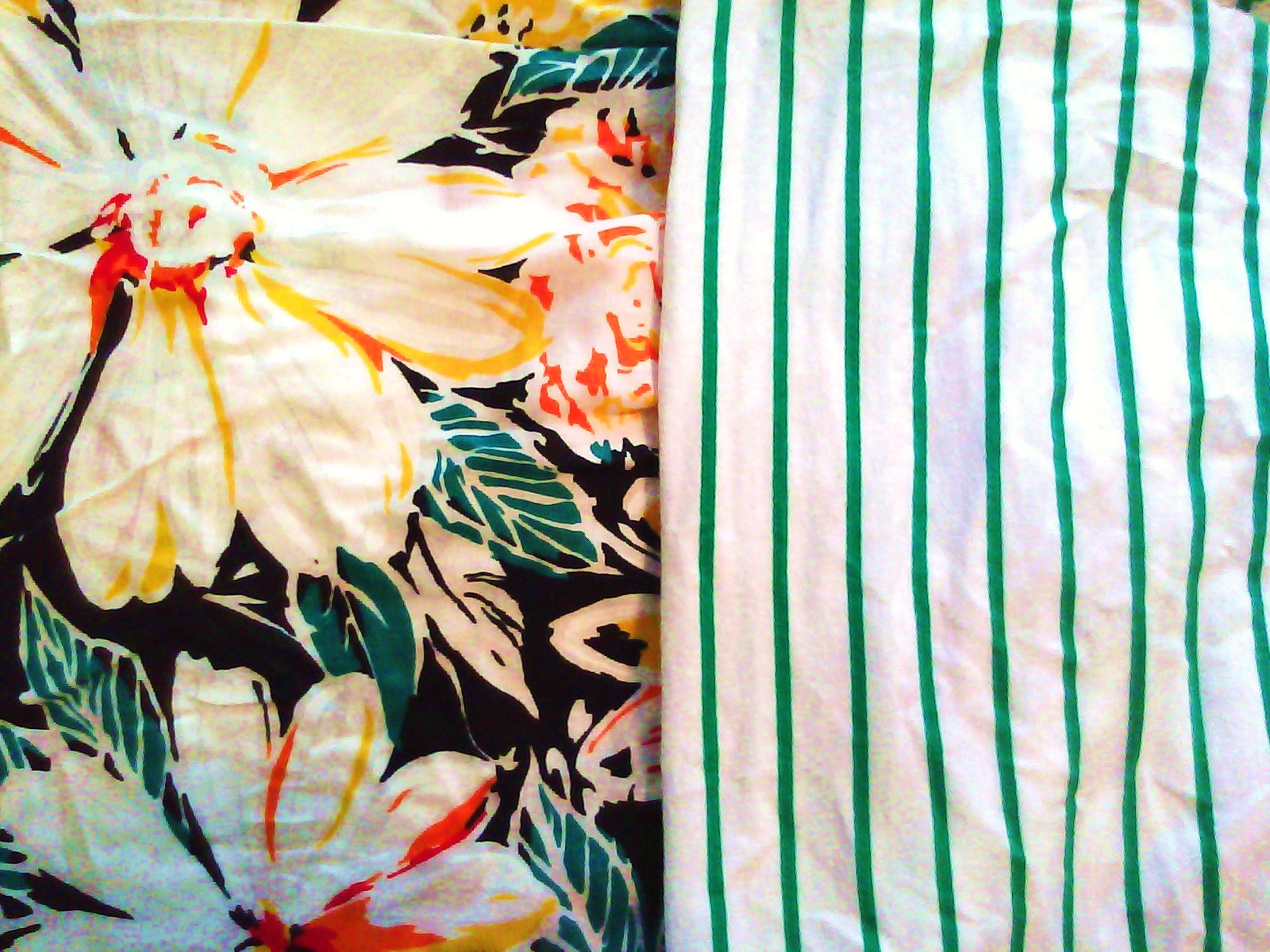
2. Pair prints with similar colors. This could be black and white stripes with black and white polka dots with black and white plaid (although it will depend on you how far you want to go). You don’t have to stick to 2 colors, but I would make sure that at least 2 of the colors in your prints match. For example, I have paired a green and white striped shirt with a red, yellow, green and white floral skirt as seen below (excuse the wrinkles!)


3. Be fearless when mixing and matching—don’t limit yourself.


4. Pattern mixing isn’t limited to just clothes. You can pair a striped tote with floral ballet flats...or you could add subtle striped tights with a polka dot skirt.


5. Kelly Framel* advises “don’t just throw things together and hope for the best." She went on to say that, "there’s an art to mixing prints…see things in absolutes, [and don’t] be distracted by the details…looking at broad tones over trivialities allows you to mix tenaciously.” (excerpt from an interview on http://www.colourlovers.com/)

Here is one last pairing that I put together for you to use as an example--enjoy!

*The ever fashionable Kelly Framel has by far one of the best fashion blogs I have ever seen. She is truly an inspiration and you can check out her blog here --> http://www.theglamourai.com/

She also inspired the newest Twelve by Twelve line at Forever 21 and has a fashion spread on their website. To see it click here.

That's all for today! Have a wonderful and fashionable Friday!

Love,
Rose

Thursday, July 1, 2010

Fashion Fridays: Inspiration, Abstract or Concrete?

A huge part of fashion is inspiration. Inspiration can come from anywhere—and for the most fashionable/fashion forward people, it rarely comes from what you see in a magazine--so don't limit yourself. Scenery, city life, photographs, people, colors, sunsets—you name it. Hell my best ideas come while I’m asleep—essentially what my subconscious held onto from the most inspirational part of that day!

There is so much beauty in the world to take in that sometimes you just have to find what makes you smile—and use that for inspiration. I know people that are inspired by the color yellow—and others that are inspired by a picture of Janet Jackson. I personally am inspired most by the beach—and for summer I usually start there. I love the colors, the people, the relaxed nature of the beach and the free flowing energy (probably why I got engaged on the beach).


I’m also inspired by the 60s…and that movie Breakfast at Tiffany’s—I’m in such awe of how formal yet casual people seemed to be back then, darling! I’m still trying to master Holly Golightly’s charm…


What YOU have to do is figure out what inspires you? What do you absolutely love? What makes you happy? Infuse that into what you put on everyday and you will love yourself that much more (and get compliments!)

Pause.

____________________________________________________________________


Okay that’s the first half of the Fashion Fridays blog (2 for 1 since I didn't post one last Friday)…the next half is for those who absolutely need to have a visual, or a magazine reference as abstract thought may not be your forté…


Something that I have found to tie in with my beach-y inspiration is something called resort wear. Resort collections have gotten widely popular only very recently. I know when you hear “resort” you think affluent or snobby—and that is exactly where these collections got their start. This is also why some designers call their collections “cruise-wear” or the “summer” collection instead, to avoid the connotation and to appeal to the masses.


Resort is like a pseudo season that is in between the traditional fall and spring. I found 2 very informative articles and will share both for you to contrast. One is from a year ago and talks about the history of and how Resort collections came to be. The other, from New York Magazine, (dated last week) talks about how the market has been flooded with Resort collections this year, and how designers are trying to stay afloat to keep up with the Jones’s…


Cynthia Rowley Resort 2010


Here is the first article from FashionPeddler.com dated July 28, 2009:

Fashion Peddler.com Resort


Okay, that was a YEAR ago, now check out this one, just published last week: by New York Magazine

Resort Report 2011: Fashion Experts Answer Ten Big Questions, Like ‘Why Does This Season Exist?’

One last tip for this week. Don't feel compelled to buy designer clothes, or to spend your hard earned money on garments that are outside of your budget. Designer items will go out of style/season just as fast as Forever 21 and H&M will, so use these designer looks as "inspiration" and be sure to stay within your clothing allowance (splurge on quality [and timeless] staple items though)! Case and point, I bought this --> vintage lace shirt (never worn) from the thrift store for $7 last summer, and it looks almost IDENTICAL to the one shown in the 1st look on Philip Lim's...

Food for thought...

happy spending (or saving!),

Love,
Rose

{ See More }

Related Posts with Thumbnails